Why motion is the new logo
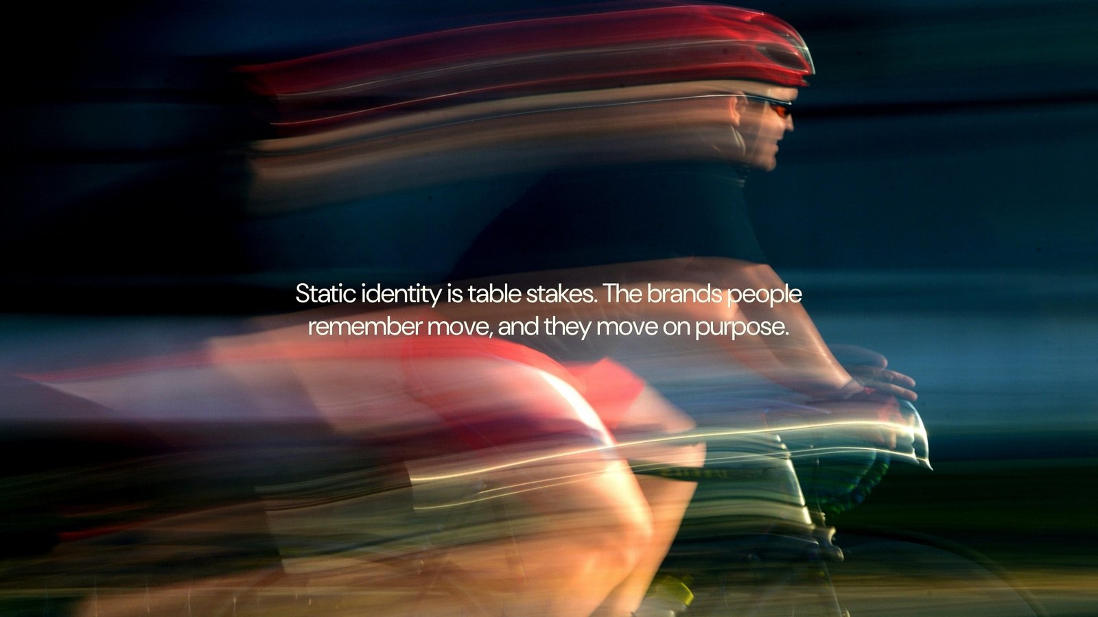
Motion is the new logo: the animated layer of a brand — how a mark moves, transitions, and sounds — has become the part people actually remember, because a static wordmark now looks the same paused on every competitor's site. A logo says who you are once. A motion system says it every time you show up.
A static mark is a commodity
Every brand has a logo. Most have a decent one — a few hours with a good designer and a Pantone chip will get you there. That used to be enough. It isn't now. Scroll any feed for ten seconds and you'll see a dozen clean, competent, forgettable logos flash past, none of them leaving a trace. The mark isn't the differentiator anymore. It's the entry fee.
Motion is a signature, not decoration
Think about the last five brands you actually remember without trying. Chances are you can picture how their logo moves — a snap, an unfold, a specific easing curve — before you can describe the shape itself. That's not an accident. Motion carries personality in a way a static file can't: pace reads as confidence or urgency, easing reads as precision or playfulness, sound reads as premium or scrappy. A wordmark tells people what you're called. Motion tells them what you're like.
A wordmark tells people what you're called. Motion tells them what you're like.
What a motion system actually includes
A motion system isn't a single animated intro. It's a small set of rules applied everywhere: how the logo enters and exits, how sections transition, how a button responds to a hover, what easing curve is “yours” across every touchpoint. Three things make it a system instead of a one-off effect:
- A consistent easing curve, used everywhere — not just on the homepage hero
- A defined vocabulary of movement — two to four signature transitions, not fifty
- Rules for restraint: where motion appears, and just as important, where it doesn't
Building it without starting from zero
You don't need to throw out your existing identity to add motion. Most brands already have the visual language — colour, type, shape — and just need the animation layer built on top of it: a short set of principles, a handful of reference animations, and guidelines your team or agency can apply consistently. The output should look and feel identical whether it's your in-house designer, a freelancer, or an editor at 11pm on deadline building the next piece. That consistency is what turns motion from a nice-to-have into part of your brand system — see building a brand system that scales for the rest of that framework.
If your brand still ends at the static logo, you're finishing the job halfway. Motion is where the rest of the impression gets made.
Frequently asked questions
Does every brand need a motion system, even a small business?
If you post video, run ads, or have a website with any interaction, yes — the animation is already happening whether you've designed it or not. The only question is whether it's intentional.
How is a motion system different from a brand guideline?
A brand guideline governs what things look like at rest — colour, type, logo usage. A motion system governs what happens when things move: timing, easing, transitions. Most brands have the first and are missing the second.
Want this kind of thinking on your brand?